Many-to-many relationships with PetaPoco
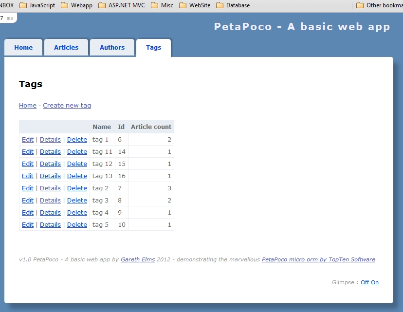
An example of a many-to-many relationship in a database are blog post tags. A blog post can have many tags and a tag can have many blog posts. So how do you do this in PetaPoco? I’ve added tag support to my PetaPoco A Simple Web App project on GitHub so I’ll explain what I did.
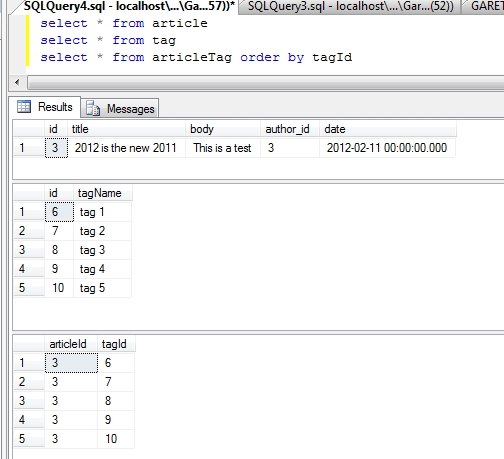
To start with you need to create a link table in your database which will stitch the article and tag tables together. So I created the articleTag table to contain lists of paired article ids and tag ids. This is all the info we need to persist this relationship in the database.
So if we have an article with 5 tags you’ll end up with 5 records in articleTag like this :
Creating these records is a one-liner if you have the article and tag ids :
	_database.Execute(
	"insert into articleTag values(@0, @1)",
		article.Id, tagId);
There is a bit more complexity when it comes to reading article pocos and their tags. There are two ways of doing it :
The naughty+1 way
You could do this :
- Load the articles without the tags.
- Loop through each article and retrieve its tags
- Assign the list of tags to each article in the loop.
This is the N+1 problem and it doesn’t scale well. The more articles you’re loading the more database round trips you’ll make and the slower your app will run. Nobody should recommend this approach, but let’s see it anyway :
	public Article RetrieveById( int articleId)
{
    var article = _database.Query(
        "select * from article " +
        "join author on author.id = article.author_id " +
        "where article.id=@0 " +
        "order by article.date desc", articleId)
            .Single
<article>();

 var tags = _database.Fetch(
 "select * from tag " +
 "join articleTag on articleTag.tagId = tag.id " +
 "and articleTag.articleId=@0", articleId);

 if( tags != null) article.Tags = tags;

 return article;
}
This example is just for one article. Imagine it if we were pulling back 50 articles. That would be 51 database round trips when all we really need is 1.
The right way
	public Article RetrieveById( int articleId)
{
    return _database.Fetch(
        new ArticleRelator().Map,
        "select * from article " +
        "join author on author.id = article.author_id " +
        "left outer join articleTag on " +
                "articleTag.articleId = article.id " +
        "left outer join tag on tag.id=articleTag.tagId " +
        "where article.id=@0 ", articleId).Single();
}
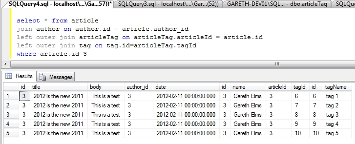
Here I am pulling back a dataset that includes the article record, the author record and the tag records. You can tell this is a many-to-many relationship by the double joining first on the articleTag then on tag itself. The results that come back to PetaPoco look like this :
As you can see there is a fair bit of duplication here and this is a trade off you will want to think carefully about. The trade off is between the number of database round trips (number of queries) and result set efficiency (network traffic from the sql server to the web server (or service layer server)). It is best to have as few database round trips as possible. But on the other hand it is better to have lean result sets too. I’m sticking with the right way.
If I was writing a real blogging app I would think long and hard about a single joined query like this because the body content, which could be thousands of bytes, would be returned as many times as there are tags against the blog post. I would almost certainly use a stored procedure to return multiple result sets so there is only one database round trip. However typical non-blogging datasets won’t contain such unlimited text data eg; orders and order lines. So there’s no problem.
Document databases suit this type of arrangement. The tags would be embedded in the article document and would still be indexable.
Stitching the pocos together
See that new ArticleRelator().Map line above? PetaPoco can utilise a relator helper function for multi-poco queries so that each poco is correctly assigned in the data hierarchy. Having the function wrapped in a class instance means it can remember the previous poco in the results.
If you’re using multi-poco queries I urge you to read the PetaPoco documentation on the subject and experiment for an hour or two. All the relator class does is take the pocos coming in from each row in the resultset and stitch them together. It allows me to add each tag to the article as well as assign the author to the article.
Turn around sir
And what about from the other angle? Where we have a tag and we want to know the articles using the tag? This is the essence of many-to-many, there are two contexts.
	public Tag RetrieveByTag( string tagName)
{
    return _database.Fetch(
        new TagRelator().Map,
        "select * from tag " +
        "left outer join articleTag on articleTag.tagId = tag.id " +
        "left outer join article on " +
        "article.id = articleTag.articleId " +
        "where tag.tagName=@0 order by tag.tagName asc", tagName)
        .SingleOrDefault();
}
This is an identical process as with retrieving articles but the tables are reversed. One tag has many articles in this context.
More responsibilities
Having many-to-many relationships does add more responsibilities to your app. For example when deleting an author it’s no longer sufficient to just delete the author’s articles followed by the author record. I have to remove the author’s articles’ tags from the articleTag table too otherwise they become data orphans pointing to articles that no longer exist. Add because we’re performing multiple database calls that are all required to succeed (or not at all), we need a transaction. Like this :
	public bool Delete( int authorId)
{
    using( var scope = _database.GetTransaction())
    {
        _database.Execute(
            "delete from articleTag where articleTag.articleId in " +
            "(select id from article where article.author_id=@0)",
            authorId);
        _database.Execute( "delete from article where author_id=@0", authorId);
        _database.Execute( "delete from author where id=@0", authorId);

        scope.Complete();
    }

    return true;
}
Adding many-to-many support to PetaPoco – A Simple Web App was fairly painless and should fill a small hole in the internet. I’ve had a few people ask about it and it seemed the natural next step for the project.
Am I doing many-to-many wrongly? Would you do it differently? Let me know so I can learn from you.
Using jQuery to display a form validation error
I’m obsessed with best practice form design and usability. There are lots of guidelines about validation messages.
I’ve decided on a way of displaying validation errors and success messages on forms for my current project. I’ve turned this into a jQuery form error plugin on GitHub which provides some quick wins :
- A single function call to display a validation message next to a field.
- A single function call to remove a validation message and optionally displays a success image in its place.
- No additional css is required.
In the GitHub project you’ll find the Index.html which demonstrates a simple form with some validation. Here’s a video of the plugin in action :
How do I use jquery.formError?
First of all you need to know when a form control has invalid data because it’s then that you want to call the plugin. I’ve kept the validation logic in the demo simple so the focus is on the plugin. If you’re using Backbone.js I can recommend the excellent backbone.validation plugin as it has the required valid/invalid callbacks you’ll need.
First you’ll need to include the jQuery.formError.js plugin javascript file. Then, to display a validation error message on an input with an id of “name” :
	$("#name").formError(
	"Name cannot be greater than 15 characters long");
To remove the validation message when you have successfully revalidated the value :
$("#name").formError( {remove:true});
By default removing the validation message will place a validation success image in place of the error. So you’ll need an icon for this like the one in the demo. To disable this behaviour :
	$("#name").formError({
   remove:true,
   successImage: {enabled:false}
});
The default image url is just “success.gif” which you can easily modify on a per-call basis :
	$("#name").formError({
   remove:true,
   successImage: {src:"img/success.gif"}
});
The plugin also gives an invalid control the css class invalid. I leave it up to you to decide the visual effect .invalid has on the control. In the demo.css file you’ll see that it applies a red border. This css class is removed when you remove the error message.
Why not put the validation message underneath the control?
It’s common for web forms to put their validation messages directly underneath the invalid control. Like this :
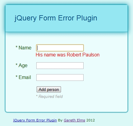
I’ve had two problems with this approach :
- The insertion of the message makes the whole form increase in size. This is a visually jarring experience for the user but there is another problem with this.
- If you type in some invalid data and then press the submit button the first even to fire is the control’s change event. If the user has just corrected some data (a common pattern just prior to pressing the submit button) a validation message may be removed from underneath the control thanks to the control’s change handler. The whole form then shrinks a little and the mouse click, whose event fires next, is no longer on the submit button. The button has moved! So you have to click it again. This is an annoying and confusing user experience.
Finally
I did start with the qTip jQuery plugin for these messages but I wanted something simpler whose HTML I could control.
Creating A Modal Dialog In A Backbone.js Kind Of Way
I’m finally using Backbone.js. It’s brilliant and I can’t recommend it enough. Backbone is not trivial but it solves a difficult problem.
So I needed a modal dialog. I messed about with a couple of modal dialog plugins but had problems getting them to work in a way that fits in with Backbone.js. After finding out how easy it is to create your own modal dialogs I decided to create a new Backbone.js view from which other views can derive and inherit modal functionality.
You can download a demo of my Backbone modal view from my Github page which looks like this :
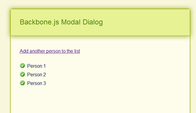
The demo doubles as a basic demonstration of Backbone.js and of my modal view. When you click “Add another person to the list” a Backbone view is created which derives from ModalView. This gives the child Backbone view a showModal() method. You just render your view as normal and then call showModal(). For example here is the click handler for the add person button :
	$("#addPersonButton").click(
   function( event) {
      // Create the modal view
      var view = new AddPersonView();
      view.render().showModal({
         x: event.pageX,
         y: event.pageY
      });
   });
The AddPersonView class extends my ModalView class like this :
	AddPersonView = ModalView.extend({
    name: "AddPersonView",
    model: PersonModel,
    templateHtml:
        "<form>" +
 "<label for="personName">Person's name</label>" +
 "<input id="personName" type="text" />" +
 "<input id="addPersonButton" type="submit" value="Add person" />" +
 "</form>",
    initialize:function() {
      _.bindAll( this, "render");
      this.template = _.template( this.templateHtml);
   },
    events: {
      "submit form": "addPerson"
   },
    addPerson: function() {
      this.hideModal();
      _people.add( new PersonModel({name: $("#personName").val()}));
   },
    render: function() {
		$(this.el).html( this.template());
		return this;
	}
});
Because AddPersonView extends ModalView you can call showModal() on your view and this happens :
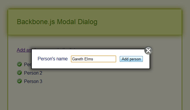
What you’re seeing is the el property of the AddPersonView instance being rendered into a modal container which gives you a few things for free :
- You can close the dialog by either pressing escape, clicking outside of the dialog or pressing the close icon
- The background is shaded back to highlight the modal view
- The focus is automatically set on the first form control in the modal view
- The modal dialog is, by default, positioned in the centre of the screen
In this example I’m positioning the dialog at the mouse cursor coordinates at the point when you click the “Add another person to the list” button. You can pass an options object to showModal() which gives you a bit of control of the internals of the modal dialog code. Here are the defaults that you can override :
	defaultOptions: {
	fadeInDuration:150,
	fadeOutDuration:150,
	showCloseButton:true,
	bodyOverflowHidden:false,
	closeImageUrl: "close-modal.png",
	closeImageHoverUrl: "close-modal-hover.png",
}
And as you have seen you can also pass in x and y properties. Hopefully these options are self explanatory except perhaps bodyOverflowHidden which helps the dialog stay on screen. The new Twitter add new tweet dialog does something like this too.
The demo includes two images that represent the close button and its hover state (it goes red when you hover over it). You can override the images easily through the showModal() parameter.
Back to the demo
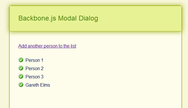
If you type a name in and press the Add person button then a person model is added to the person collection. Because this is Backbone.js this automatically triggers the rendering of a new PersonItemView into the PersonListView :
I’m Happy
I’m happy I stepped back and learned javascript properly and got into Backbone.js. I find that being self critical and determined makes you a better developer. Backbone.js forces you to break your UI down into small units and collections of units, each with their own set of event handlers. And it forces you to do this before you start creating your UI. This is crucial because it enforces design and forethought, the absence of which normally leads to big balls of code mud.
To learn Backbone.js I found the following resources useful :
- Joey Beninghove’s Backbone.js Quickly screencast
- PeepCodes Backbone.js Basics and Backbone.js Interactivity screencasts
- Tekpub’s Backbone.js APS.NET MVC 3 screencast
- Chris Strom’s stream of Backbone.js consciousness
- Nik Gauthier and Chris Strom’s Recipes With Backbone book
- The top quality Backbone.js documentation
- Rob Conery’s blog posts where he refactored the ToDo list demo
Finally I know that modal dialogs are known to be not in the best interests of usability but there is a subtle difference between true I-want-to-take-over-your-app-and-secretly-own-the-whole-world modal dialogs and these soft easily-closed dialogs. Facebook uses soft dialogs, as does Twitter. Use inline editing where it makes sense and a separate page where a modal dialog is being asked to do too much.
Download the code and demo from github or see the demo page live in action
Update: v0.3 is complete adding a few new features I needed.

